This post has already been read 177555 times!
We all know that supply chains are becoming more and more global, but how often can we actually see them becoming more global? The site vox.com has compiled 38 maps that explain the global economy. We’ve selected 6 that are especially relevant to supply chains.
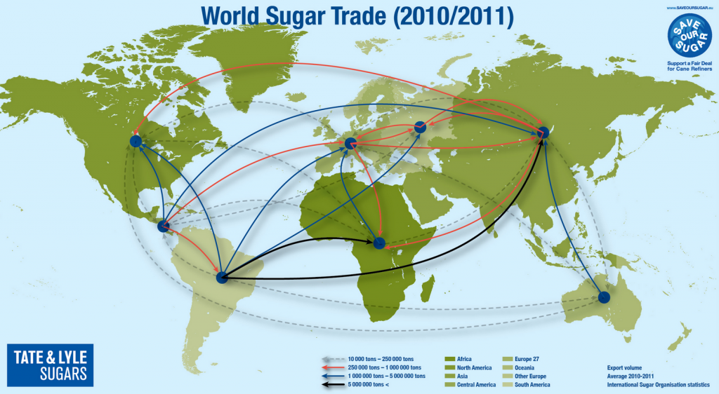
#1: How Sugar Circulates Globally
Even seemingly simple commodities have complex supply chains. What’s interesting about this map is that all regions are both importing and exporting sugar…
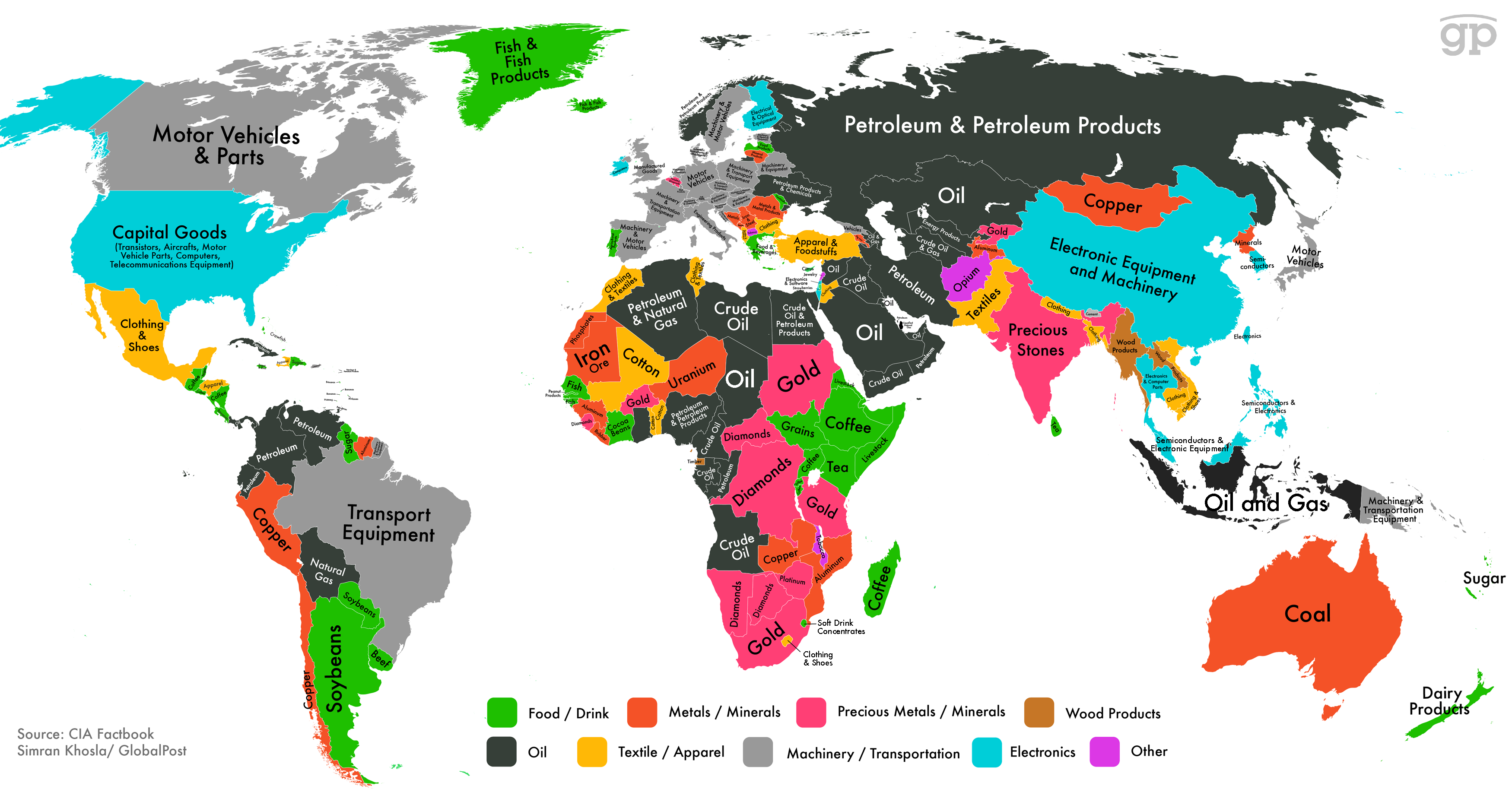
 #2 World Export Map

This map from Simran Khosla charts each country’s biggest export category, and also color-codes the categories into larger groups.

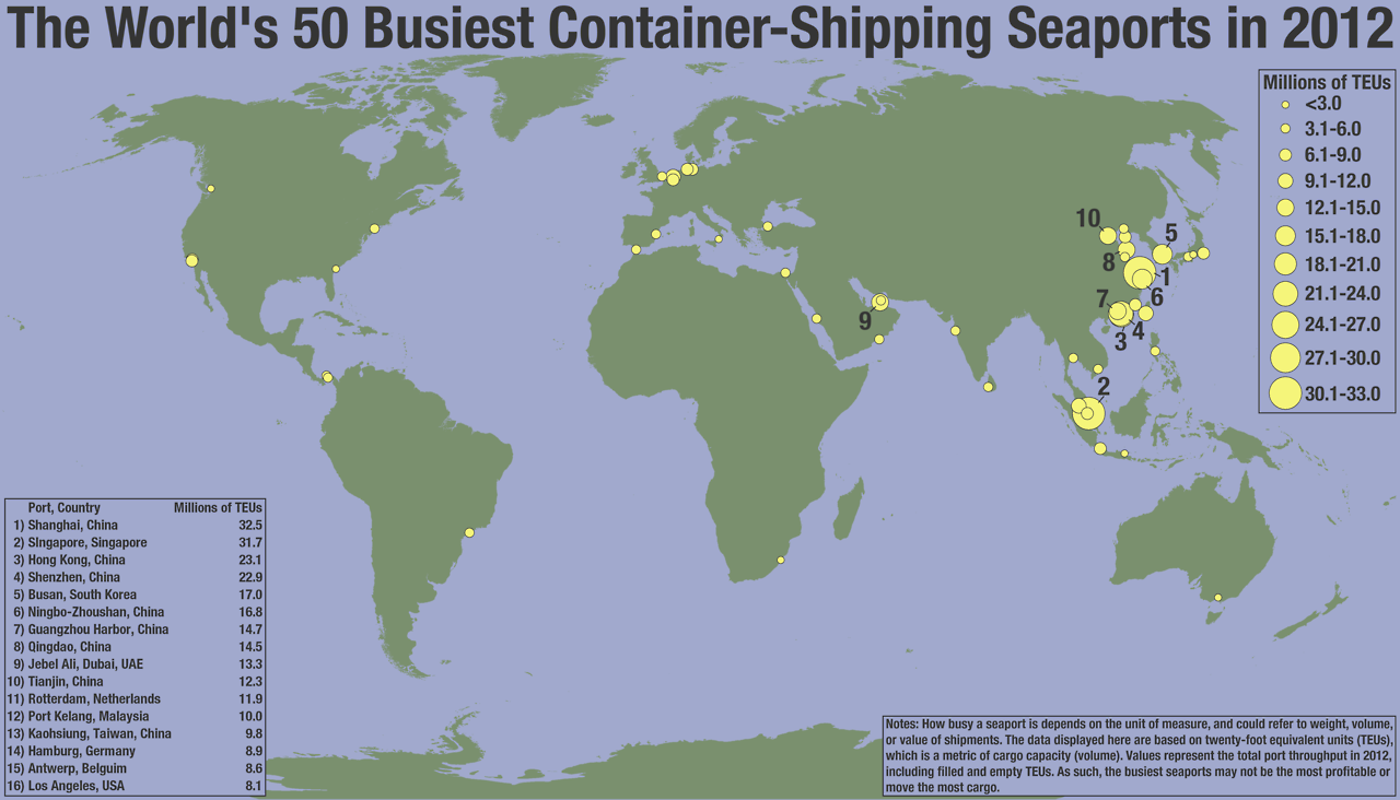
#3 Busiest Container Ports
This Seth Kadish map shows the locations of the 50 busiest on the planet, and the size of the dots is scaled to the quantity of goods they handle. Asia’s increasingly dominate role in manufacturing is evident here.
#4 World Trade is More Important
This map by Max Roser shows the volume of trade each country conducts relative to the size of its overall economy. Global trade has increased for almost every country…another reason for today’s far-flung and outsourced supply chains.
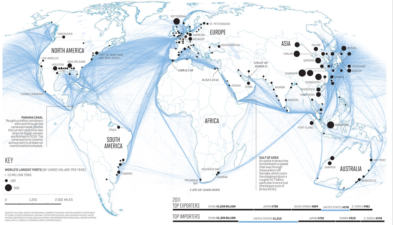
") #5 World Shipping Routes
#5 World Shipping Routes
")
Nicholas Rapp made this image of global shipping routes, which have become especially important since the invention of the shipping container.
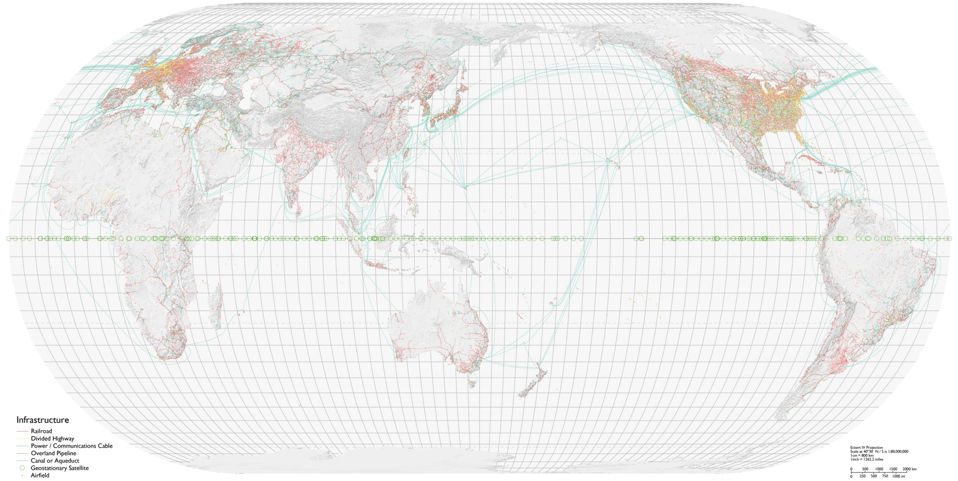
#6 World Infrastructure Map
This map by Bill Rankin shows every major piece of infrastructure in the world, highlighting (among other things) the supply chain challenges of doing business in large parts of the world.
To read more about how the supply chain is changing, I suggest you read the new whitepaper, Supply Chain’s New World Order”, which discusses the cloud, S&OP, and why a holistic approach is needed for supply chain management.
- The 4PL Revolution Roundup: Top 8 Opportunities for Today’s Logistics Providers - December 15, 2015
- Demand Sensing Round-Up (Blog Posts, White Papers, and Webinars!) - December 15, 2015
- Your Favorite Posts of 2015 - December 4, 2015